

Our Favorite Rebrands
And what made each one actually work.
Rebranding feels dangerous. Too little change and nobody notices. Too much change and you risk losing the customers who already trust you. The sweet spot — where timing, design, and strategy converge — is rarer than the industry likes to admit.
What makes a rebrand succeed or fail
Before getting to the specifics, it's worth establishing what we're actually evaluating. A rebrand that wins design awards but damages commercial performance isn't a good rebrand. The standard we use is whether the new identity clarifies positioning, extends the brand's relevance, and holds up across the surfaces the brand actually needs to operate on.
David Aaker's brand equity framework, discussed elsewhere in this series, is useful here. A successful rebrand either preserves existing brand equity — the accumulated associations, awareness, and loyalty — while updating the expression, or it deliberately repositions the brand to build new equity in a different direction. The ones that fail tend to throw away equity without building anything in its place.
The five rebrands below each did something distinct and did it well. Our analysis of why they worked draws on what the research says about positioning, visual identity, and the relationship between the two.
Source: Aaker, D., "Managing Brand Equity," Free Press, 1991
Slack — 2019
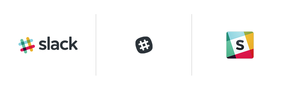
The original Slack logo was both adorable and terrifying. Visual discrepancies were eliminated while maintaining individuality in the 2019 makeover.
The original Slack logo was a plaid hashtag in eleven colours — charming at startup scale, unworkable at enterprise scale. The 2019 redesign reduced it to four colours, standardised the geometry, and built a system that could survive being rendered at 16px on a phone screen without dissolving into noise.
What Slack understood, and what research on processing fluency supports, is that a mark which is hard to process at small sizes creates friction every time it appears. Gitte Lindgaard's work on first impressions tells us that visual judgments form in 50 milliseconds. An identity that reads clearly at any scale is doing foundational credibility work every time it appears. The redesign was as much infrastructure decision as aesthetic one.
Airbnb — 2014
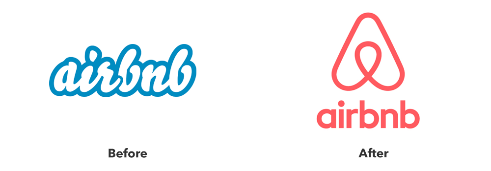
The internet was divided when Airbnb debuted the "Bélo." Beneath the clutter, however, was a clever strategy change: from a marketplace for lodging to a lifestyle brand focused on belonging.
Airbnb replaced a functional but generic wordmark with the Bélo — a symbol designed to represent belonging, people, places, and love simultaneously. The internet had opinions. Underneath the noise was a deliberate repositioning: from accommodation marketplace to lifestyle brand built around a single unifying idea.
Airbnb's rebrand is a textbook illustration of what Ries and Trout described in Positioning (1981): the brand that wins is not necessarily the best product, it's the one that owns the clearest position in the consumer's mind. "Belong Anywhere" staked out emotional real estate that no hotel chain could credibly occupy. The Bélo was the visual anchor for that claim.
The best repositioning claims territory competitors can't follow you into. "Belong Anywhere" was a claim no hotel could make.
Burger King — 2021
While everyone was trying to modernize, Burger Kind did the opposite. Rather than going the route of hyper-minimalism and modernism, it went retro.
While the rest of the fast food industry was chasing flat, minimal, tech-adjacent aesthetics, Burger King went in the opposite direction. The 2021 rebrand by Jones Knowles Ritchie reached back to the brand's 1969–1994 visual era — rounded letterforms, warm food-adjacent colours, no artificial-looking gradients.
The Burger King rebrand is a useful counter-example to the assumption that modernization means minimalism. Byron Sharp's research on distinctiveness argues that brands should leverage and strengthen their existing distinctive assets rather than abandon them for trend-driven redesigns. Burger King's heritage assets — the warmth, the roundness, the food-first palette — were more distinctive than anything a fresh minimalist redesign would have produced. Going backward was the most forward-thinking option available.
Source: Sharp, B., "How Brands Grow," Oxford University Press, 2010
Dropbox — 2017
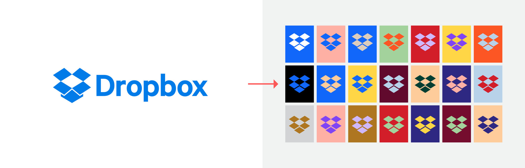
Dropbox Rebrand
Dropbox went the opposite direction of most brands, by choosing to be louder and positioning itself as a platform for creative cooperation, rather than "boring cloud storage."
Dropbox surprised everyone by getting louder. The new identity, developed with Collins, moved away from the reliable-but-forgettable blue box and toward a vivid, generative visual system built around creative collaboration. The message was explicit: this is not boring cloud storage.
Dropbox's rebrand is a case study in using visual identity to communicate repositioning. When a product category becomes commoditised, competing on features becomes a race to the bottom. The rebrand signalled a different competitive dimension — creative culture and community — that the product's competitors were not positioned to claim. Jennifer Aaker's research on brand personality is relevant here: the new Dropbox was claiming an "excitement" dimension that the incumbent cloud storage market had entirely vacated.
Source: Aaker, J.L., "Dimensions of Brand Personality," Journal of Marketing Research, 1997
Instagram — 2016
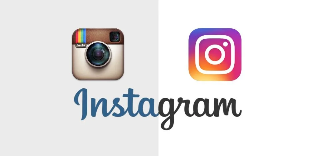
When it first came out, Instagram’s gradient logo seemed sudden, but time has shown that it was the ideal choice.
The skeuomorphic camera icon was replaced with a flat gradient glyph. The initial reaction was largely negative. With eight years of hindsight, the decision looks correct. The old icon was charming on a 2012 phone screen. It had no future as a small, fast-moving identifier across the surface area Instagram was about to occupy.
Instagram's rebrand is a reminder that the right decision and the popular decision are not always the same thing. Lindgaard's research on 50-millisecond first impressions applies differently at icon scale: a mark that reads clearly and distinctively at 60 pixels is doing more useful work than a more detailed one that blurs. The gradient was polarising precisely because it was unfamiliar. Familiarity returns quickly. Scalability, once lost in a design, is difficult to recover.
What the best rebrands share
Across these five cases, the pattern is consistent enough to be worth naming directly.
None of the five rebrands above were primarily aesthetic decisions. Each was a strategic decision expressed through visual means. The Slack redesign was an infrastructure decision. Airbnb's was a positioning decision. Burger King's was a distinctive asset decision. Dropbox's was a market differentiation decision. Instagram's was a scalability decision. The visual outcome in each case was downstream of a clear answer to the question: what does this brand need to communicate, and to whom?
The best repositioning claims territory competitors can't follow you into. "Belong Anywhere" was a claim no hotel could make.
If you're considering whether it's time to rebrand, the most useful question isn't "does our logo feel dated?" It's "has something shifted in our positioning, our audience, or our market that our current identity no longer reflects?" The visual work follows from the answer to that question. When it precedes it, rebrands tend to produce new logos for old problems.